Rebranding The classic bike shop
A local bike shop was taken as a case study for this specific rebrand. The aim of the project was to change brand perception from generic and quaint to innovative and experienced so as to build brand awareness and distinguish the company from local competition.
Creating a Design System
TARGET AUDIENCE
Young to middle aged professionals with cycling experience
BRAND REACH
Road, city, electric and mountain bikes
TONE
Experienced, innovative and approachable
Young to middle aged professionals with cycling experience
BRAND REACH
Road, city, electric and mountain bikes
TONE
Experienced, innovative and approachable
Final Logos
Extending the Brand
Branding Collateral and Accessories
Stickers to be given away when bikes are purchased as well as for brand awareness. Stickers would come in both 2"x2" size was well as 3"x3" size.
Water bottles would also be complimentary with bike purchase as well as for sale in the store.
LEFT: Business cards for employees featuring their specialty.
RIGHT: Information cards for customers to take with them with notes from their visit.
RIGHT: Information cards for customers to take with them with notes from their visit.
Apparel


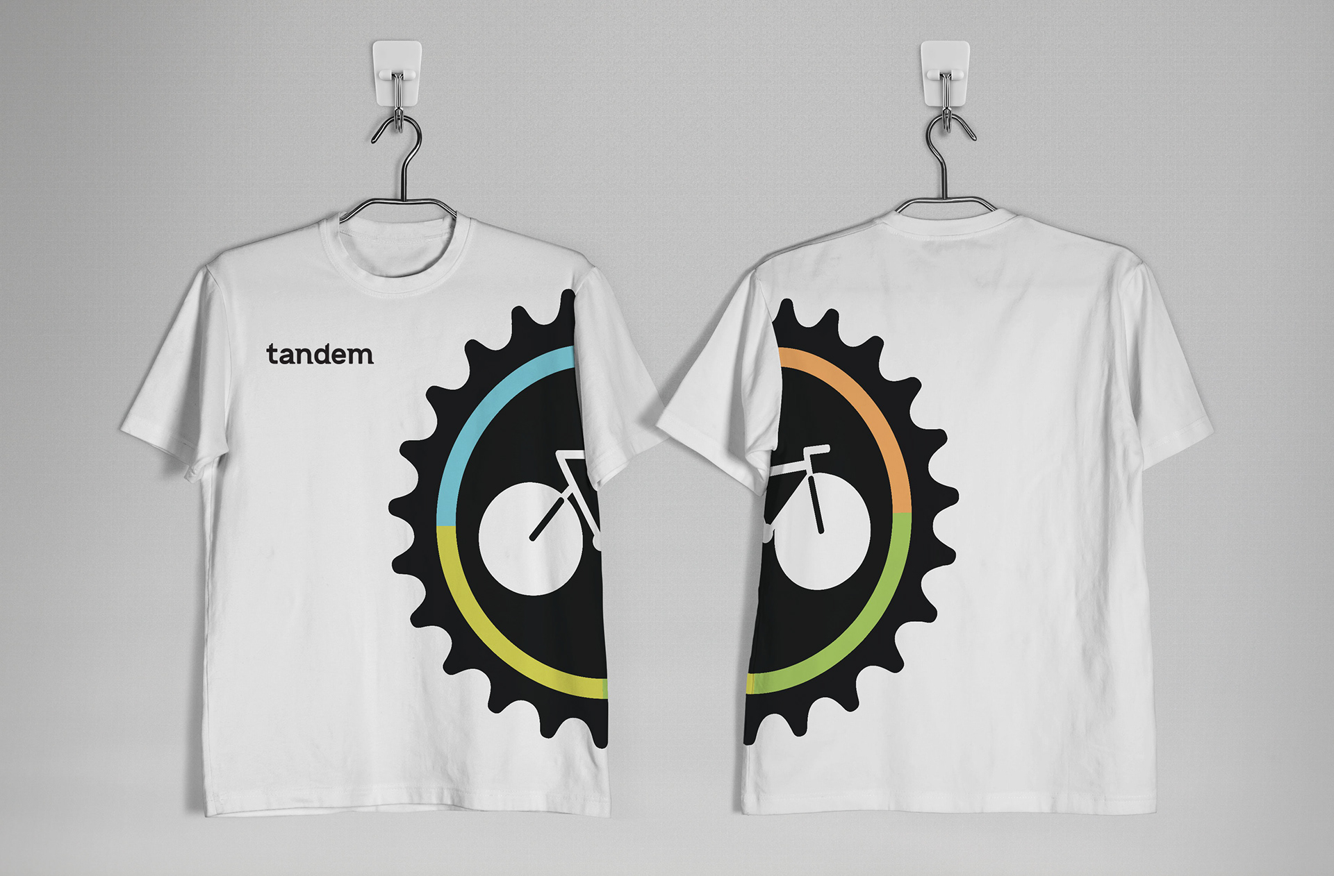
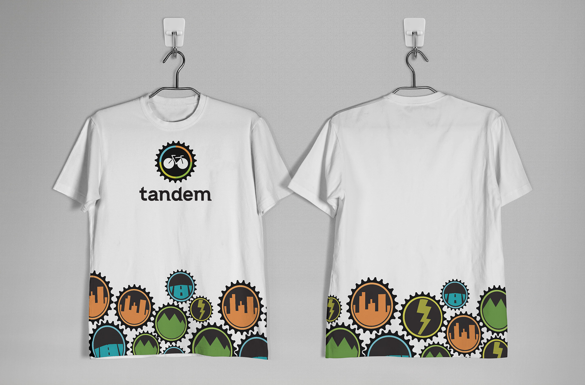
The white shirts would be for sale for the public. The color shirts are for the employees. Each employee would have access to all four shirts but would be encouraged to wear the color that they consider their specialty.
Vehicle Wrapper and In-Store Graphics
Online Presence
The social media presence of Tandem.
The flowchart for the Tandem website.
